A Behind the Scenes Look at Our Rebrand
You may have noticed that we recently gave our brand a facelift. After analyzing feedback from all of YOU and stretching our design muscles, we’re excited to finally unveil our new look, along with a few messaging changes. Keep reading to find out all about it!
Why the change?
It has been over ten years since we refreshed our image, and since then, technology has vastly altered the way we communicate. Back in 2008 when we came up with our previous logo, Facebook had only been around for a few years, and Instagram hadn’t even launched yet. Today, like most nonprofits, we connect with our audiences largely through our website and social channels, and we needed to make our logo translatable across all platforms.
We also took this opportunity to reexamine our overall brand personality in the eyes of our audience. When it came to our mission, we noticed a lack of alignment with the way our network has evolved, and equally important, with what we actually do each day.
Our process
A lot of thought went into our rebrand. As an organization that leads more than 70 affiliates across the state, we interact with a multitude of businesses, partners, and volunteers, and we found it critical to include them in this journey. In May, we sent a survey to our entire network, and before we made any decisions, we analyzed those results. We also formed a review committee with representation from all of our audiences to provide us with feedback throughout the creative process.
Our logo
At its core, we wanted our new logo to reflect our commitment to sustainability while remaining fun, modern, and relatable. As we designed it, we kept several ideas in mind:
A simpler color scheme
A more classic and legible typeface
Using blues and greens to represent our role as an environmental organization
Ensuring our final image reflected our presence throughout the state
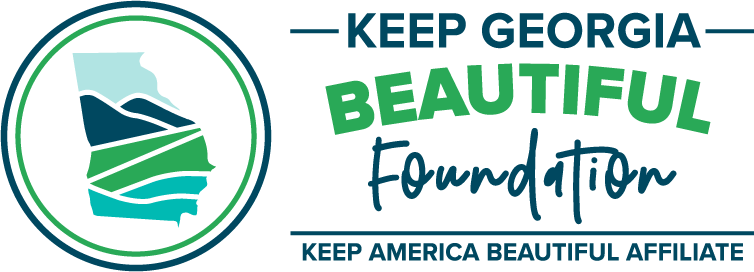
After several rounds of designing and editing, we ultimately chose to use a state outline as our main image. This illustrates that we strive to protect and improve the environment in communities across Georgia, and by including mountains, water, and greenery within, we give a subtle nod to the look of our old design.
Our messaging
We’ve made changes to our mission and initiatives to better reflect the work we do each day. Our old mission focused on the support we provide to our network of affiliates. Although that makes up a huge part of our efforts, it isn’t all we engage in. We welcome non-affiliated organizations to work with us through two of our largest events, Bring One for the Chipper and the Great American Cleanup, and we also provide guidance to communities and individuals who are interested in becoming more sustainable. In order to include everyone in our mission, whether they’re already involved or interested in learning more, we changed it to the following:
To educate and inspire Georgians to take action every day to improve and beautify their community environments
We also decided to make waste reduction its own initiative. We already promote this idea actively along with our other three focus areas of litter prevention, recycling, and community beautification. Now it will simply receive the attention it deserves on our website and printed materials.
The long and short of it
Whether you’ve followed us for a while or found us today for the first time, we’ve made a lot of changes, but we’re still the same organization working hard to make Georgia cleaner, greener, and more beautiful. We hope our new look inspires you as much as you inspire us!

